Your Web Design Inspiration Since 1992
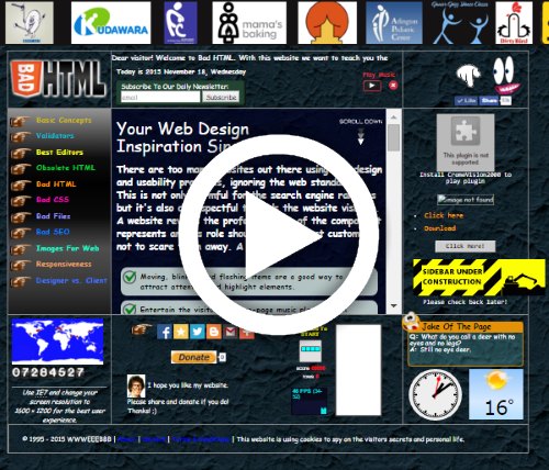
There are too many websites out there using bad design and usability practices, ignoring the web standards. This is not only harmful for the search engine rankings but it's also disrespectful towards the website visitors. A website reveals the professionalism of the company it represents and its role should be to attract customers, not to scare them away. A few tips:
- Moving, blinking and flashing items are a good way to attract attention and highlight elements.
- Entertain the visitors with on-page music player which starts to play automatically.
- Use HTML tables to layout the sections of the site (header, footer, sidebar etc.).
- Let the visitors know what browser and screen resolution provides the best user experience so they can adjust their settings.
- Use gradients and shadows to show that the site is using the latest CSS3 technology.
- Include entertaining widgets to make sure the visitor never gets bored while browsing your pages. It's useful if the visitor can play games, read jokes, see the current weather or can see the server time on every page.
- Don't forget to mark conversion funnels with Click Here pointers.
- Make sure the background image is seamless so the visitor can't notice that in fact the same picture is repeating.
- Mark the unfinished sections of the site with animated Under Construction banners so the user can check back later when it's finished.
- Invite visitors to subscribe to your newsletter and update them with the latest news in emails every day. Use a hard Captcha verification to avoid robot attacks.
- Use Java and Flash widgets. Include links to download and install browser extensions that are necessary to play them.
- Use hit counters to prove the popularity of the site.
- Use a custom mouse pointer which fits the design.
- Ask visitors to like your Myspace page, make donations and click different banners.
Now you know the most important rules of how to make a really flashy, cutting edge website!

It's a good start to know these rules but you can learn more browsing the articles in the sidebar. Bad HTML is a very small site, containing just a couple pages and you can read through them very quickly. We have collected the basic concepts of web development, listing all terms you need to know to get started. We have listed the basic web terminology, the best online HTML Editors, converters and cleaners and there's a separate page for online web validators which help you analize your website. We have listed the bad practices for HTML, CSS, file management, SEO and we have collected the most useful links with free online tools.
Switch The Design
This website comes with two different stylesheets. The default design is a cutting-edge, popping, eye-catching, flashy design, but you can switch to a simple one clicking the button in the bottom-right corner of the screen. This will add a marker to the URL and render the page with a simple white design. You can decide which version to send or share.


 I hope you like my website.